
Understand AEM powerfull Sling Resource Merger, Override and Overlay concepts
Overlay: In Adobe Experience Manager (AEM), overlay is a method of customizing the default components and functionalities without directly altering the core files. To make changes, you create a copy of the component in the /apps folder and update the copy as needed. This approach enables you to modify or extend the functionality of AEM’s built-in components while preserving the original files, ensuring that your customizations remain intact during system updates.
Note: Components present inside the “/apps” hierarchy cannot be overlayed. eg, AEM core components.
Sling Merger in AEM: The Sling Merger is a feature in Apache Sling (the framework behind AEM) that helps combine resources from different locations into one. It decides which version of a file or configuration to use when multiple copies exist.
In AEM, there are two main places where resources are stored:
- /libs: Contains AEM’s built-in features and components, AKA OOTB components.
- /apps: Used by developers to customize and extend AEM’s functionality.
The Sling Merger prioritizes resources in /apps over those in /libs. This allows developers to safely customize or extend AEM without changing its core files.
Common use cases of Sling Merger:
- Customizing Components: You can modify built-in components (like Image or Text components) without touching the original files in /libs.
- Adding New Features: Extend existing components by adding new features or properties, while keeping the original features intact.
- Managing Configurations: Override default settings (like dialogs or templates) by creating custom configurations in /apps.
- Ensuring Safe Upgrades: Since changes are made in /apps, the original files in /libs remain untouched. This ensures your customizations stay safe when AEM is upgraded.
How AEM Finds and Uses Resources: Easy Guide to Resource Lookup with Sling Merger
In Adobe Experience Manager (AEM), when the system processes a request (like loading a component), it decides which file or resource to use by following a simple process called Resource Lookup. This is managed by the Sling Merger, which combines files from different locations in AEM. Here’s how it works:
Step 1: AEM Checks /apps First
AEM first looks in the /apps folder. This is where developers put their customizations, like modified components or configurations. If AEM finds a file in /apps, it uses that version.
Step 2: AEM Falls Back to /libs
If AEM doesn’t find the resource in /apps, it checks /libs. The /libs folder contains AEM’s built-in (out-of-the-box or OOTB) files. This fallback ensures AEM always has a working version of the resource, even if no customizations exist.
Step 3: Combining Resources (Merge) Sometimes, developers only customize part of a resource in /apps. In this case, AEM combines (or “merges”) the custom parts from /apps with the default parts from /libs. This allows you to only update what you need while reusing the rest of the functionality from /libs.
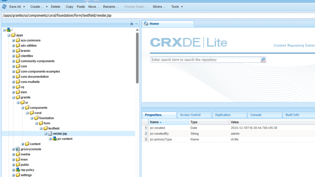
Example: Overriding the Default AEM Textfield Component
- Create a new folder structure under /apps that mirrors the following path: /apps/granite/ui/components/coral/foundation/form/textfield.
- Create a file named render.jsp within this folder. This file will contain the HTML structure for your customized textfield component.
- Modify the HTML (render.jsp):
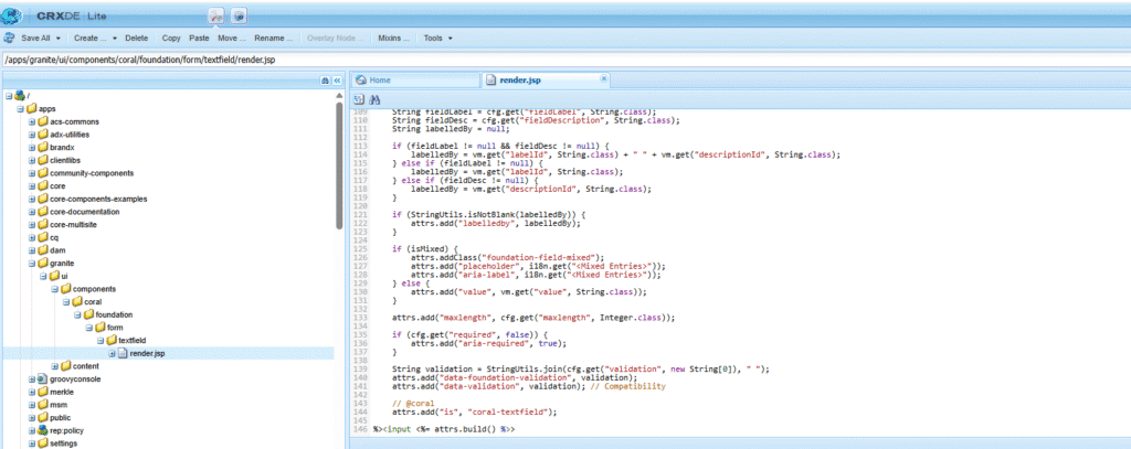
- Copy the original HTML: Start by copying the contents of /libs/granite/ui/components/coral/foundation/form/textfield/render.jsp into your custom render.jsp file.
- Make changes in render.jsp
- granite/ui/components/coral/foundation/form/textfield text field resource is used in the button component.
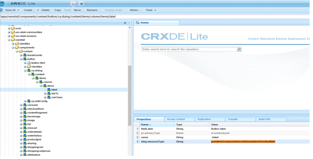
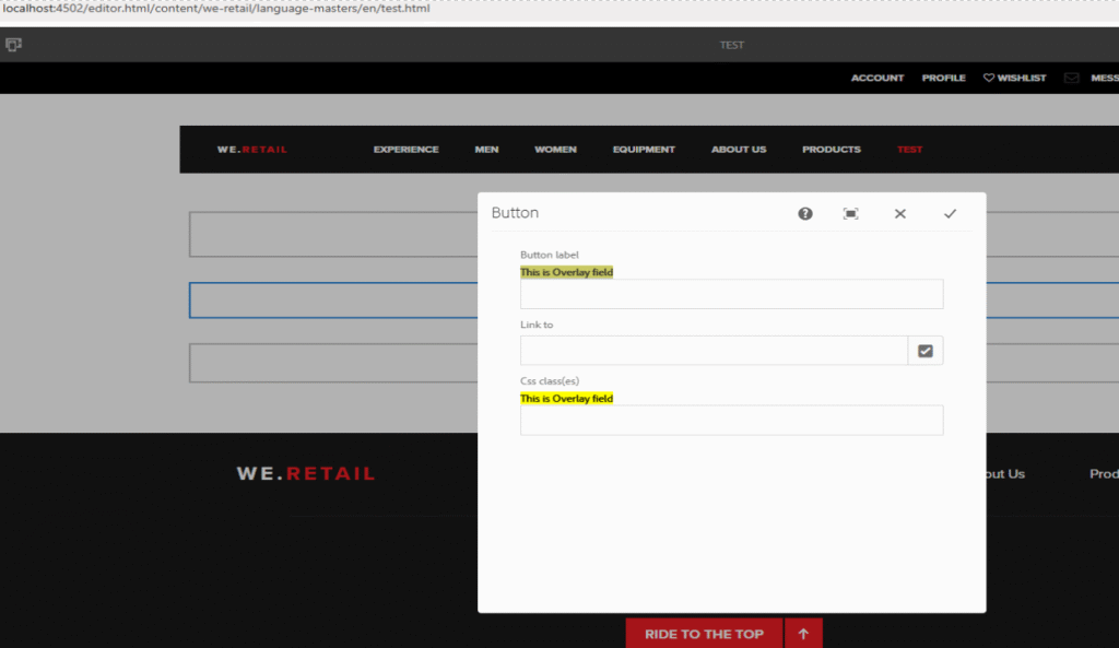
- Here you can see the custom implementation of the resource
- Resolve and Use:
- When AEM encounters a component that uses sling:resourceType=”granite/ui/components/coral/foundation/form/textfield”, it will first look for the implementation under /apps.
- Since you’ve created a custom implementation, AEM will use your version of render.jsp instead of the default one from /libs.
Override: In Adobe Experience Manager (AEM), override means replacing the default version of a component or resource with your own custom version. Unlike an overlay, where you make changes to a copy of the original component, an override completely replaces the original with your version. This gives you full control, especially when you need to change a component or resource completely.
A common task for AEM developers is creating component dialogs. Sometimes, the new dialog is very similar to an existing one. Instead of recreating it from scratch, an override allows you to replace the default dialog with a custom one, giving you the flexibility to change only what’s necessary while keeping the overall structure the same.
How Override Works in AEM
When you override a component in AEM, the default component stored in /libs is replaced by your custom version, which is stored in /apps. This ensures that only your version is used.
The sling:resourceSuperType property is used to inherit functionality from the original component. For example, when overriding Basic Page, it allows you to retain the core page features while changing its behavior, such as modifying the dialog, by pointing to the original component.
Note: – You can also override components inside the “/apps” hierarchy.
Example of Override in AEM with sling:resourceSuperType:
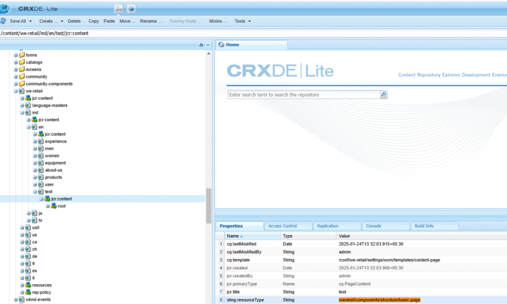
In Adobe Experience Manager (AEM), when you override a component, you replace the default component (stored in /libs) with your custom version (stored in /apps). For example, let’s say you want to override the basicpage component from /libs/wcm/foundation/components/basicpage/v1/basicpage.
- Create a New Component in /apps: component is created from this hierarchy /apps/weretail/components/structure/basic-page.
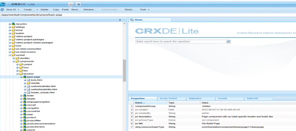
- Use sling:resourceSuperType: Inside your custom basic-page component, you use the sling:resourceSuperType property to inherit core functionality from the default basicpage component in /libs. This ensures your custom component still keeps the original features and behavior while allowing you to add your custom logic.
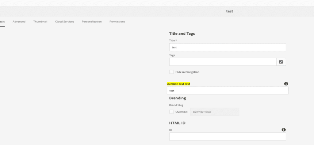
- Customize the Component: With this setup, you now have full control over the basicpage component. You can modify properties, change the dialog, or adjust its behavior while keeping the core functionality of the original component intact. For example, I just added a new text field to the basic-page component dialog.
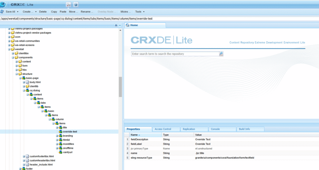
After updating the basic-page dialog, our new text field is coming, and other default fields are also coming from the parent page.